
What Your Industry Benchmarks Actually Mean (And Why Generic Averages Are Dangerous)
Your dashboard says gross margin is 42%. You Google "average gross margin for [your industry]" and find a report saying the industry average is 45%.
Conclusion: You are underperforming. You need to cut costs or raise prices.
Except that industry average came from a report aggregating businesses doing $500K to $500M in revenue. Half of them are in different states with different labor costs. A third of them have completely different business models than yours. And none of them are actually in your situation.
You just made a strategic decision based on a number that has almost nothing to do with your business.
This is why generic benchmarks are dangerous.
The Problem With "Industry Average"
Industry averages collapse every variable into a single number. When someone publishes "average restaurant labor cost is 30%," they are combining:
A food truck with no servers and a fast-casual chain with 50 locations
A fine dining restaurant in Manhattan and a diner in rural Ohio
A seasonal beach town cafe and a year-round urban breakfast spot
The resulting 30% tells you nothing about what good looks like for your specific situation. It is an average of things that are not comparable.
But it shows up first in Google. So business owners use it as truth.
What Makes a Benchmark Actually Useful
A useful benchmark has three characteristics:
1. Revenue Band Match
A $2M business and a $20M business in the same industry have completely different cost structures. The $20M business has economies of scale, centralized operations, and negotiated vendor rates. The $2M business does not.
Comparing yourself to an industry average that includes both is like comparing your marathon time to the average of recreational joggers and Olympic runners. The number is real. It is also useless.
2. Business Model Match
Two companies in "professional services" can have radically different economics. A consulting firm that bills by the hour has different margin expectations than a design agency selling fixed-price projects. A law firm with five partners has different overhead than a solo attorney.
If the benchmark does not distinguish between these models, it is not measuring what you think it is measuring.
3. Geographic and Seasonal Context
Labor costs in San Francisco are not the same as labor costs in Nashville. A business that does 60% of its revenue in Q4 should not have the same inventory turns as a business with even quarterly distribution.
Generic benchmarks ignore this. They give you the average of everywhere and everyone, which is the reality of nowhere and no one.
The Danger of False Precision
Here is what actually happens when you optimize against a bad benchmark:
You see that "industry average payroll is 28%" and yours is 34%. You cut two positions to get closer to the benchmark. Six months later, customer complaints double because you are understaffed during peak times. Revenue drops 12%.
The problem was not that you were overstaffed. The problem was that 28% was the wrong target. That number came from businesses with different seasonality, different customer service expectations, and different revenue per employee than yours.
You fixed a problem that did not exist and created one that did.
What Real Peer Data Looks Like
At Brownstone, we compare your metrics to anonymized data from actual clients in your industry, revenue band, and business model. Not a report you found online. Not a survey of 500 companies. Real businesses we have worked with, filtered to match your situation.
When we tell you your gross margin is weak, we are comparing you to other $2M-$5M service businesses in your region who serve similar customers. When we say your payroll is high, we are comparing you to peers with the same seasonality and staffing model.
The benchmark is not a guess. It is a real number from real businesses facing the same constraints you face.
How to Evaluate Any Benchmark You Encounter
Before you make a decision based on any industry benchmark, ask three questions:
1. What revenue range does this cover? If it includes businesses 10x your size or one-tenth your size, ignore it.
2. Does this distinguish between business models? If it treats all "restaurants" or all "consultants" as the same, it is too broad to be useful.
3. Where did this number come from? If the source is "industry reports" or "online research" with no methodology, treat it as directional at best.
If you cannot answer all three, the benchmark is not reliable enough to drive strategy.
Know What Good Actually Looks Like
You deserve better than generic industry averages pulled from the internet. You deserve to know how your business compares to actual peers - businesses in your revenue band, with your business model, facing your constraints.
That is what proprietary benchmarks give you. Not a guess. Not an average of everything. A real answer.
Want to Know Where You Actually Stand?
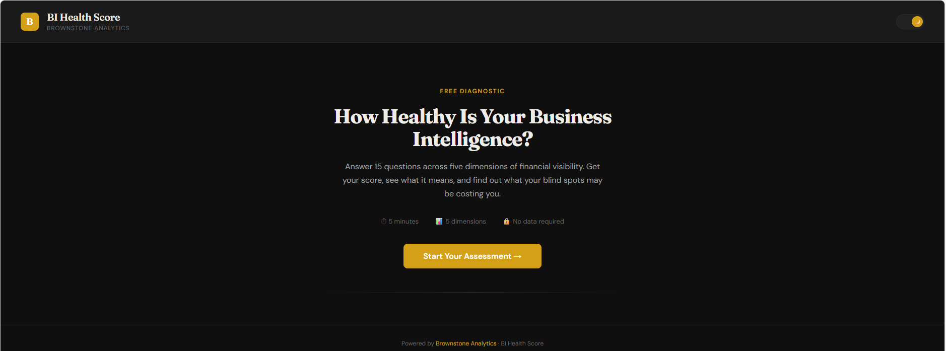
Take our free BI Health Score assessment. Answer 15 questions, get a score across five dimensions of decision-making, and see where your business intelligence gaps are costing you clarity.
Take the Free BI Health Score Assessment →
If your score surfaces a gap you want to close, book a free 30-minute discovery call. We will walk through what it means for your business and whether Brownstone can help you close it.
Book Your Free Discovery Call →
AUTHOR BIO: Paul Brown is the Founder of Brownstone Analytics, a fractional Chief Data Officer firm helping small and minority-owned businesses make smarter, faster decisions using data. Based in the NYC/Westchester area.
Why Your Business Dashboard Failed (And What to Do Instead)
You spent $5,000 on a dashboard. Maybe $10,000. You got exactly what you asked for: revenue by month, margin by product line, customer acquisition cost, lifetime value, churn rate, pipeline coverage, inventory turns.
Twenty charts. Real-time data. Clean design. Professional polish.
And six months later, you are still making the same decisions the same way you made them before the dashboard existed.
The dashboard did not fail because it was built wrong. It failed because it answered the wrong questions.
The Dashboard Showed You Everything. You Needed to See Something.
Most business dashboards fail for the same reason: they optimize for completeness instead of clarity.
You get every metric you might need. Revenue, expenses, margins, growth rates, customer counts, average order values. The theory is that if all the data is there, the insights will reveal themselves.
They do not.
What happens instead: You open the dashboard on Monday morning. You see 47 data points. Some are up, some are down, most are flat. You spend 10 minutes scanning. Nothing jumps out. You close it and go back to running your business the way you always have.
The dashboard becomes a report you check occasionally to confirm what you already suspect, not a tool that changes what you do.
You Built a Dashboard. You Needed a Diagnosis.
Here is the difference:
A dashboard tells you gross margin dropped 3 points last quarter. That is data.
A diagnosis tells you the margin drop came from three things: you raised wages in March without adjusting pricing, your top product shifted from 60% to 52% of sales mix, and your largest customer negotiated a 5% discount you did not model for.
The dashboard cannot tell you that. It can show you the number. It cannot connect the number to the decisions that caused it.
The Three Things Missing From Most Dashboards
1. Context: What Does Good Look Like Here?
Your dashboard says payroll is 34% of revenue. Is that good or bad?
Depends. If you are a consulting firm, 34% might be excellent. If you are a product company, it might be a disaster. If you are seasonal and this is your high-volume quarter, it might be exactly right.
Without industry benchmarks, peer comparisons, and historical trends specific to your business model, the number is just a number.
2. Prioritization: Which Metric Actually Matters Right Now?
Not all metrics matter equally at all times. If you are cash-constrained, receivables aging matters more than revenue growth. If you are scaling, customer acquisition cost matters more than gross margin.
Most dashboards give you all the metrics with equal weight. You end up scanning everything and acting on nothing.
3. A Clear Next Action: What Do I Do With This Information?
Your dashboard shows customer churn at 8%. Now what?
Do you call your top 10 customers? Do you survey recent cancellations? Do you review your onboarding process? Do you change your pricing structure?
The dashboard does not know. It just shows you the number and waits for you to figure out what it means.
What to Do Instead
If you already have a dashboard that is not working, do not throw it away. Fix the layer above it.
Start with one question you are actually trying to answer. Not "how is the business doing?" but something specific: "Are we profitable enough to hire another person?" or "Should we raise prices or cut costs?"
Then identify the 3-5 metrics that answer that question. Not 20. Not 10. Three to five.
Then compare those metrics to something real: your own history, your peer group, your plan. Context turns data into insight.
Then decide what you will do differently if the metric moves 10% in either direction. If the answer is "nothing," delete the metric. It is noise.
Start With Diagnosis, Not Dashboards
This is where Brownstone operates. We do not start with the dashboard. We start with the decision you are trying to make. Then we identify which 3-5 metrics actually matter for that decision. Then we show you what good looks like in your situation - not a generic benchmark, but real peer data from businesses in your revenue band and industry.
You are not paying us to build another dashboard. You are paying us to tell you which numbers matter, what they mean, and what to do next.
Want to Know Where Your BI is Breaking Down?
Take our free BI Health Score assessment. Answer 15 questions, get a score across five dimensions of decision-making, and see where your blind spots are costing you clarity.
Take the Free BI Health Score Assessment →
If your score surfaces a gap you want to close, book a free 30-minute discovery call. We will walk through what it means for your business and whether Brownstone is the right fit to fix it.
Book Your Free Discovery Call →
AUTHOR BIO: Paul Brown is the Founder of Brownstone Analytics, a fractional Chief Data Officer firm helping small and minority-owned businesses make smarter, faster decisions using data. Based in the NYC/Westchester area.
AI Can Build Your Dashboard. It Cannot Tell You What Is Wrong.
You can have ChatGPT build you a dashboard in 10 minutes. Connect your QuickBooks, tell it what you want to see, and it will give you revenue charts, margin breakdowns, customer segments - the whole package.
The dashboard will look professional. The numbers will be accurate. The charts will update in real time.
And you still will not know what is actually wrong with your business.
Here is why: AI can process data. It cannot diagnose problems.
The Dashboard Tells You What. Diagnosis Tells You Why.
Your dashboard says gross margin dropped 4 points last quarter. That is data.
A human analyst asks: Did you change suppliers? Did you raise wages without raising prices? Did you shift product mix toward lower-margin items? Did a big customer negotiate a discount you did not account for?
The dashboard cannot ask these questions. It cannot connect the margin drop to the operational decision that caused it. It just shows you the number and waits for you to figure out what it means.
AI Cannot Earn Trust
Let's say your dashboard shows payroll at 38% of revenue when industry standard is 32%. You know you are overstaffed. The question is where.
A human analyst looks at labor productivity by department, compares output per employee, identifies where you have two people doing one person's job. Then - and this is the part AI cannot do - they ask you why.
Maybe that "extra" person is the owner's nephew. Maybe that department has high turnover and you are always training someone new. Maybe you tried cutting staff last year and customer complaints doubled.
AI does not know to ask. It does not have the business context. It does not have the trust to push back when your first answer does not add up.
AI Cannot Validate Its Own Recommendations
Say your dashboard recommends raising prices 8% based on competitor analysis. Sounds reasonable. You implement it.
Three months later, revenue is down 12%. What happened?
A human analyst would have asked: Are your customers price-sensitive? Do they have alternatives? Are you competing on price or on service? Is 8% a big enough increase to trigger switching, or small enough that they will not notice?
AI runs the calculation. It does not stress-test the assumption. It does not know whether your business can absorb the risk if the model is wrong.
The Gap Between Data and Decisions
This is where Brownstone operates. Not in the dashboard build - AI can do that part. In the diagnostic layer that turns numbers into action.
We identify which patterns from 15 years of Fortune 500 work apply to your situation. We compare your metrics to real anonymized peer data, not generic industry averages. We validate recommendations against your actual constraints and risk tolerance.
You are not paying us to build the dashboard. You are paying us to tell you what is wrong, why it is wrong, and what to do about it before you waste money fixing the wrong problem.
AI can show you the numbers. We tell you what they mean.
5 Numbers Every Small Business Owner Should Check Every Monday Morning
You walk into Monday with a full week ahead. Decisions to make, vendors to call, employees to manage, customers to serve.
But here is the question most small business owners cannot answer before noon on Monday: Is my business actually healthy right now?
Not last quarter. Not at tax time. Right now.
The gap between "I think we are doing well" and "I know exactly where we stand" is where most small businesses lose money quietly, without ever seeing it happen. Revenue looks fine. The bank account feels okay. And then one slow month exposes a problem that was building for six.
The solution is not a bigger accounting team or an expensive ERP system. It is five numbers, reviewed every Monday morning, that tell you the real story of your business before the week gets loud.
Here is what those numbers are and why each one matters.
Number 1: Cash on Hand vs. Cash This Time Last Week
What it is: Your current bank balance compared to your balance seven days ago.
Why Monday, why weekly: Monthly cash reporting is too slow for a small business. A single bad week of collections or an unexpected expense can put you in a dangerous position before your monthly statement ever arrives. Checking weekly keeps you ahead of it.
What to look for: A consistent downward trend over three to four weeks is an early warning sign, even if your total balance still looks comfortable. Most business owners only panic when the number is low. Smart operators panic when the direction is wrong.
The action trigger: If cash dropped more than 15% week over week without a known cause (a big vendor payment, a seasonal dip you planned for), dig into accounts receivable before anything else.
Number 2: Outstanding Receivables Older Than 30 Days
What it is: Money customers or clients owe you that has not been collected yet.
Why it matters: Revenue you have earned but not collected is not real until it hits your account. Many small businesses look profitable on paper while slowly running out of operating cash because invoices are aging unpaid. This is one of the most common and least visible ways businesses bleed out.
What to look for: Any invoice past 30 days needs a status. Past 45 days, you need a plan. Past 60 days, you likely need a conversation and potentially a policy change.
The action trigger: If more than 20% of your outstanding receivables are over 30 days old, your collections process has a gap. That is not a client problem. That is a systems problem.
Number 3: This Week's Revenue vs. Weekly Target
What it is: What you brought in last week against what you needed to bring in to hit your monthly and annual goals.
Why most owners skip this: They either do not have a weekly target set, or they are measuring revenue monthly and hoping it averages out. Hoping is not a strategy.
What to look for: One or two weeks under target is normal. Three or more consecutive weeks under target means your pipeline has a problem that compounding will not fix.
The action trigger: If you are trending 10% or more below your weekly target by Wednesday, the week is not lost, but waiting until Friday to notice means losing five days of corrective action.
Number 4: Top Expense Category vs. Prior Week
What it is: Your single largest expense line item this week compared to the same category last week.
Why just one category: Business owners who try to review every expense line on Monday mornings end up paralyzed or skimming without insight. Picking your highest expense category forces you to know where your money is going in detail, rather than in aggregate.
What to look for: Unexpected spikes in payroll, materials, software subscriptions, or contractor spend are usually the culprit when margins shrink without an obvious reason. Many business owners discover they are paying for tools or services they stopped using months ago.
The action trigger: Any unexplained increase of more than 10% in your top expense category deserves a line-item review before approving any new spending that week.
Number 5: Customer or Client Activity Metric
What it is: One number that tells you whether your customer base is growing, stable, or shrinking. Depending on your business model, this might be:
New inquiries or leads this week
Repeat purchases vs. prior week
Active clients with open projects
Appointment bookings for the next 14 days
Why this is the leading indicator the other four miss: Cash, receivables, revenue, and expenses are all lagging indicators. They tell you what already happened. Customer activity is leading. It tells you what is coming.
What to look for: Two to three weeks of declining customer activity almost always precedes a revenue dip by three to six weeks. If you are watching this number weekly, you have time to respond. If you are not, the revenue drop is your first notification.
The action trigger: A 20% drop in your key customer activity metric is the signal to evaluate your pipeline, your referral sources, and your follow-up process before the month closes.
The Monday Morning Ritual (15 Minutes or Less)
You do not need a finance degree or a full analytics team to review these five numbers. What you need is:
A consistent source for each number (QuickBooks, your POS system, a simple spreadsheet)
A place to track them week over week so you can see trends, not just snapshots
Fifteen minutes every Monday morning before your day starts
The business owners who make smart decisions fast are not smarter than you. They are better informed, more consistently, at the right frequency.
Want to Know How Your Business Scores Right Now?
Brownstone Analytics built a free BI Health Score tool that benchmarks your business across five key performance areas in under three minutes. No spreadsheets. No jargon. Just a clear picture of where your data and decision-making process stands today.
Take the Free BI Health Score Assessment → https://demo.brownstoneanalytics.org/bi-health-score.html
If your score surfaces a gap you want to close, we offer a complimentary 30-minute strategy call to walk through what it means for your specific business.
Paul Brown is the Founder of Brownstone Analytics, a fractional Chief Data Officer firm helping small and minority-owned businesses make smarter, faster decisions using data. Based in the NYC/Westchester area.